Cycle Safari
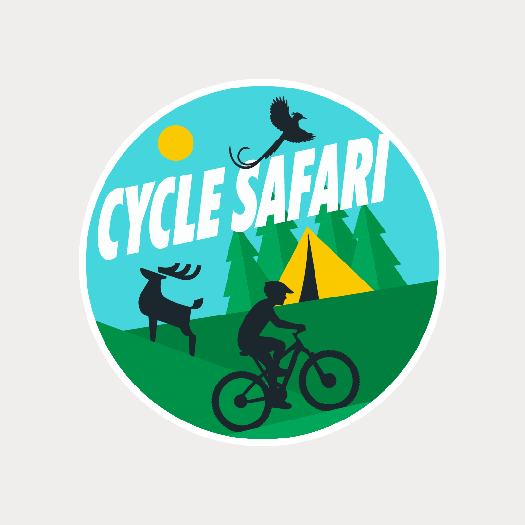
The logo for
Cycle Safari visually captures the spirit of adventure, exploration, and
immersive outdoor cycling experiences. Designed within a circular badge format,
the identity feels unified and community-driven—symbolising the journey,
continuity, and togetherness that define group cycling expeditions.
The illustration-based logo combines multiple elements from the company’s
experience offerings into one cohesive landscape. The cyclist in the foreground
immediately establishes the core activity and represents the thrill of
exploration and personal adventure. Surrounding natural elements such as
forests, mountains, wildlife, and open terrain communicate the diverse
environments covered during the tours—from village trails and forest routes to
mountainous expeditions. The camping tent subtly references the brand’s
overnight camping experiences (S24O) and multi-day adventure rides, reinforcing
the idea of travel, discovery, and outdoor living.
The upward-angled typography adds movement and momentum, mimicking the energy
and elevation of cycling journeys. The bird in flight enhances the feeling of
freedom, wanderlust, and immersive travel experiences. Bright greens and blues
create a fresh, energetic, and nature-oriented palette, while the yellow sun
introduces warmth and optimism—reflecting memorable holidays and meaningful
outdoor experiences.
Overall, the logo successfully transforms the brand’s service offering into a
compact visual story, making it feel adventurous, welcoming, and experiential
rather than just activity-focused.