Digital/Print Design
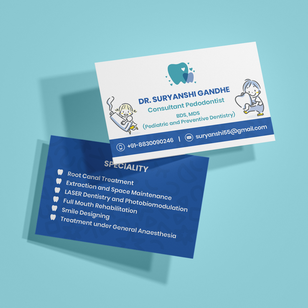
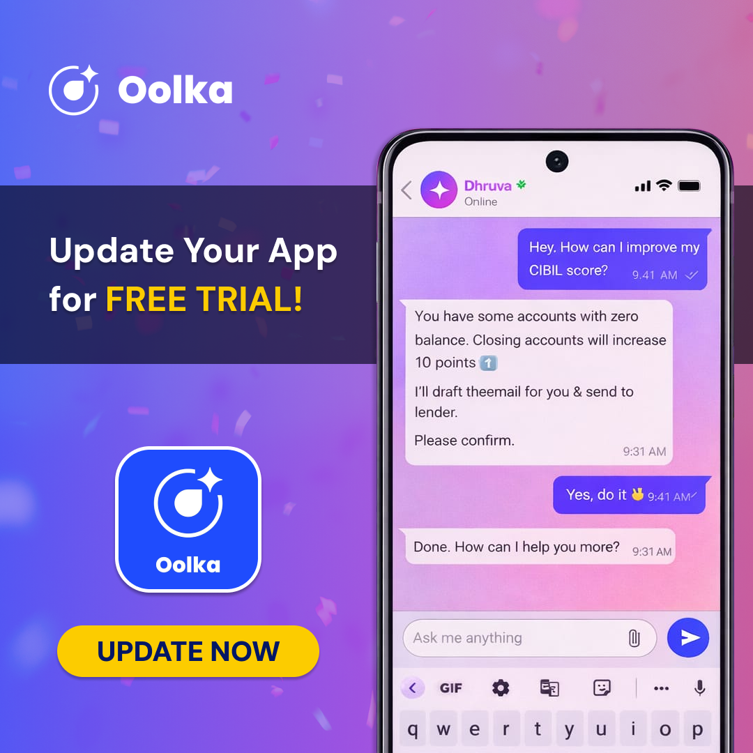
I have worked on a wide range of digital and print media projects including social media campaigns, marketing creatives, posters, brochures, presentations, print advertisements, event graphics, and motion-based content. Having experience in both agency setups and freelance projects has helped me adapt to fast-paced campaign work while still maintaining strong visual consistency and attention to detail.
Logo Projects
FHC Logo
The company wanted to rebrand its existing identity and move away from the outdated visual language of the previous logo. The redesign focused on creating a cleaner, more contemporary identity inspired by modern design principles while still reflecting the company’s educational background and core values. The goal was to keep the logo simple, versatile, and easy to recognize, while building a visual identity that felt professional, approachable, and relevant to today’s audience.
Udiyo Logo
This logo was conceptualized and designed for a corporate event called “Udiyo,” inspired by the idea of flight and forward movement. One of the key requirements from the client was to incorporate “YO”, representing the parent company - YO Edutech Solutions Pvt. Ltd., into the visual identity of the event. To achieve this, the bird icon was stylized in a way that subtly integrated the letters “YO” within its form, allowing the event branding and the company identity to come together seamlessly. The final design aimed to feel modern, dynamic, and symbolic of growth, ambition, and elevation.
Solarise Logo
This logo was designed for Solarise Renewables India Pvt. Ltd., a company focused on sustainable energy and clean power solutions. The identity combines multiple renewable energy symbols into a modern and dynamic visual system. The icon merges the sun, solar panels, and a lightning bolt with an upward arrow to represent solar energy generation, electrical power, and future growth. The yellow and blue colour palette reflects sunlight, clean technology, trust, and sustainability, while the italic typography adds a sense of motion and progress. Overall, the logo was created to communicate innovation, reliability, and the company’s commitment to environmentally responsible energy solutions through a clean and impactful visual identity.
GST-CP Logo
The GST Common Portal logo was designed for a platform focused on simplifying the understanding of GST and tax-related concepts for both professionals and the general public. The goal of the project was to create a visual identity that felt approachable, trustworthy, and easy to recognize while reflecting the informative nature of the platform. The overall design approach focused on clarity and accessibility, aligning with the portal’s objective of making complex taxation concepts easier to understand through a user-friendly digital experience.
Video Animations
Sunkersett Explainer Video
This explainer video was created for an investment company with the objective of presenting financial information in a clear, engaging, and visually dynamic format. While the graphic assets and visual elements were provided by the client, the complete animation and motion design process was executed by me using Adobe After Effects. The project involved a fast-paced, animation-heavy workflow completed over the course of a week, with a strong focus on smooth transitions, visual clarity, and maintaining consistency throughout the video. The final outcome successfully translated the client’s content into an engaging motion piece that aligned with their communication goals and brand identity.
FHC Brand Video
This infographic video was created to visually present the journey and growth of the company through a simple and engaging narrative format. The entire project — from conceptualization and storyboarding to animation and final rendering — was designed and executed by me using Adobe After Effects. With a very tight production timeline of just 16 hours, the project required a fast and efficient creative approach. To ensure smooth execution within the deadline while accounting for revisions, rendering limitations, and system performance, I chose a clean whiteboard animation style that balanced clarity, flexibility, and visual storytelling. The project was delivered successfully within the given timeframe with minimal revisions required in the final draft.
The Magic Carrot
This storybook-style animated video was created for a global spiritual organization, designed to present a short narrative through an immersive visual storytelling format. The concept was built around a stylized 3D book, where each page unfolds the story through a combination of animated illustrations and synchronized text transitions. The left side of the book featured animated visual scenes, while the right side focused on animated typography and narrative text, creating a balanced reading and viewing experience. The overall animation style was designed to feel calm, engaging, and visually expressive while maintaining the essence of storytelling through motion and page-based interaction.
Brand Guidelines
Slide to view the Brand Guidelines.
Visual/Print Projects