NOIR SOCIAL
Designing a premium cafe and lifestyle identity through bold geometry, modular typography, and a cinematic visual system.
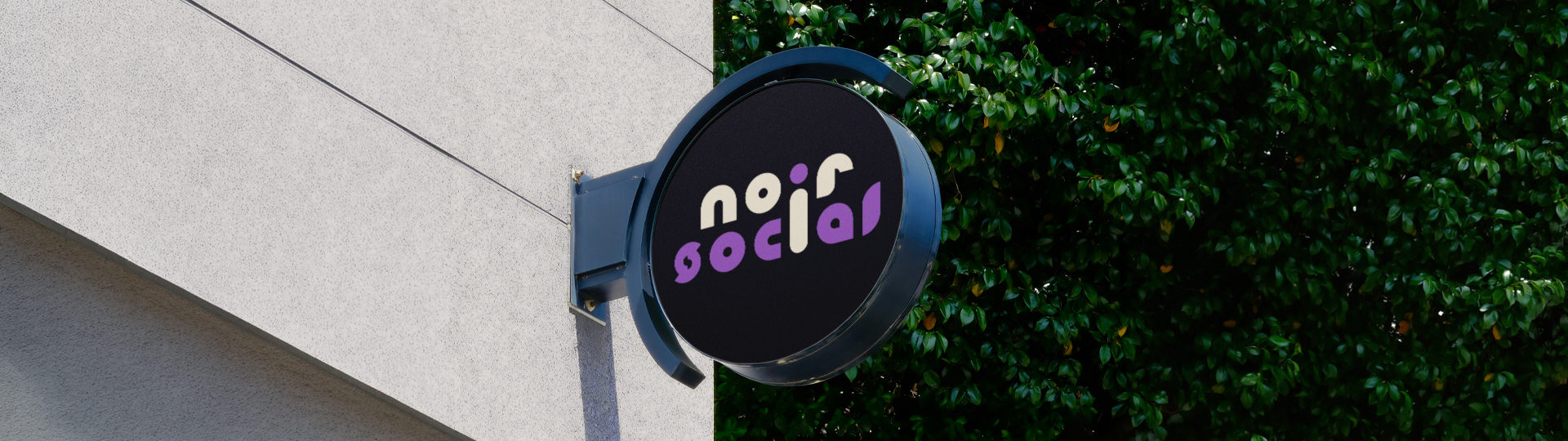
DESIGNING THE IDENTITY
FOR NOIR SOCIAL
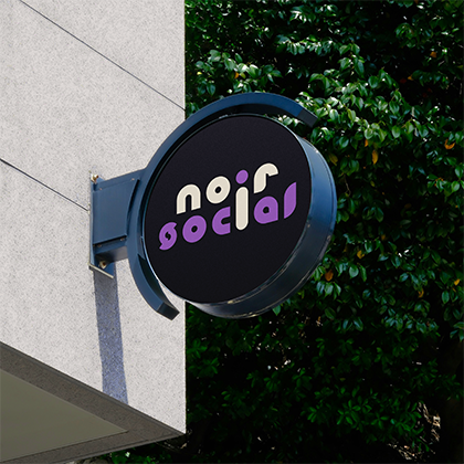
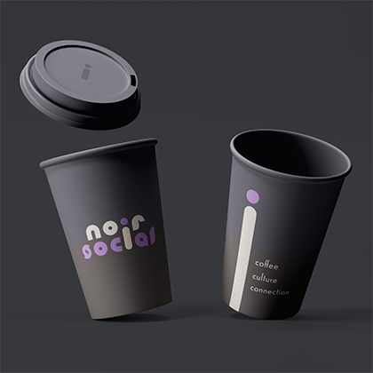
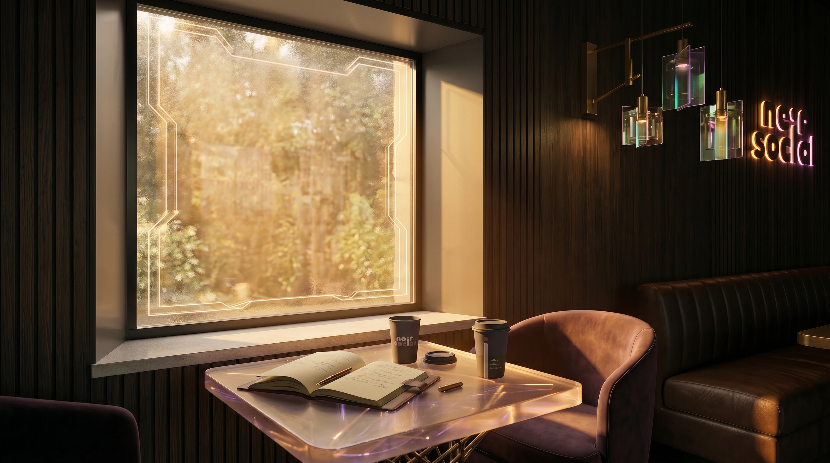
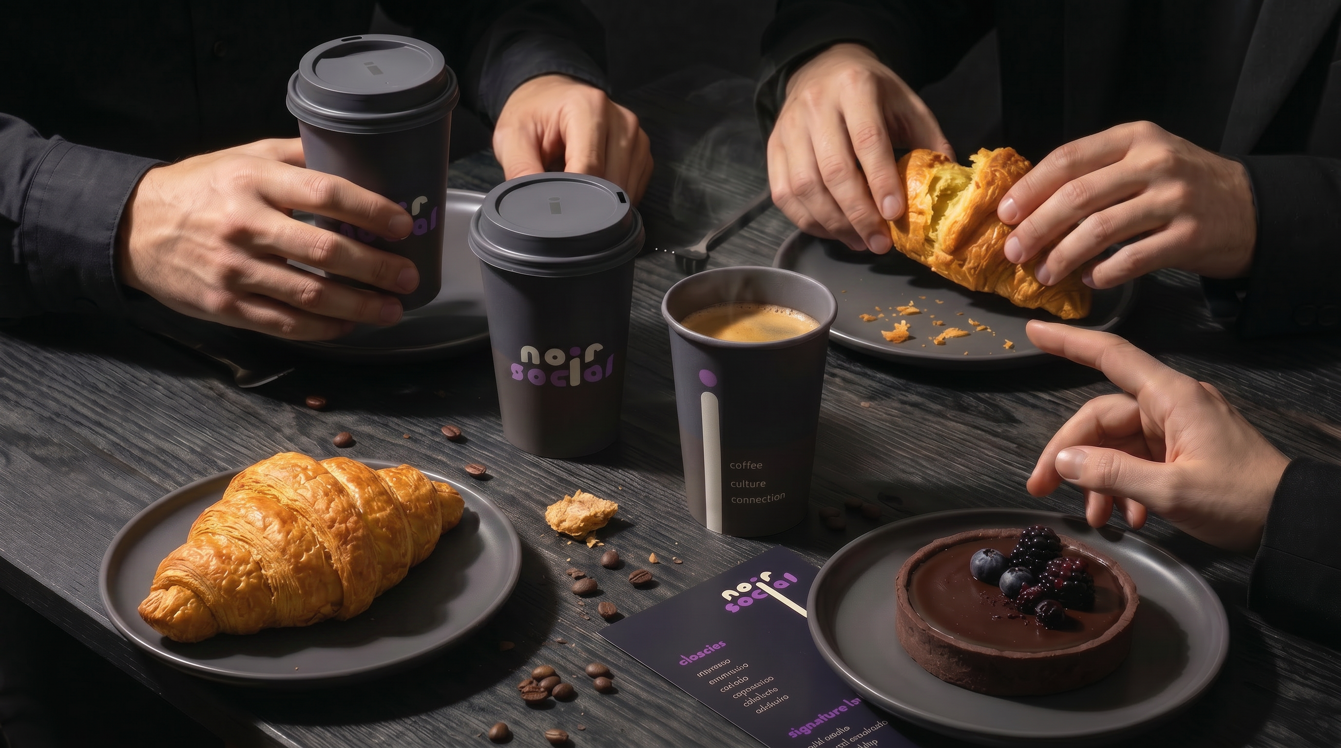
Noir Social needed an identity that felt artistic, modern, and ownable across cafe branding, social media, packaging, and merchandise. The brief called for a mark that could look minimal in one context and expressive in another without losing recognition.
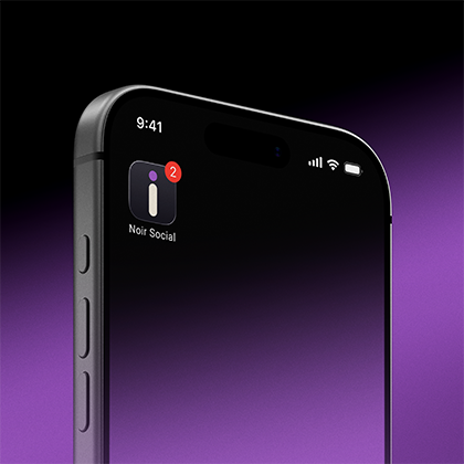
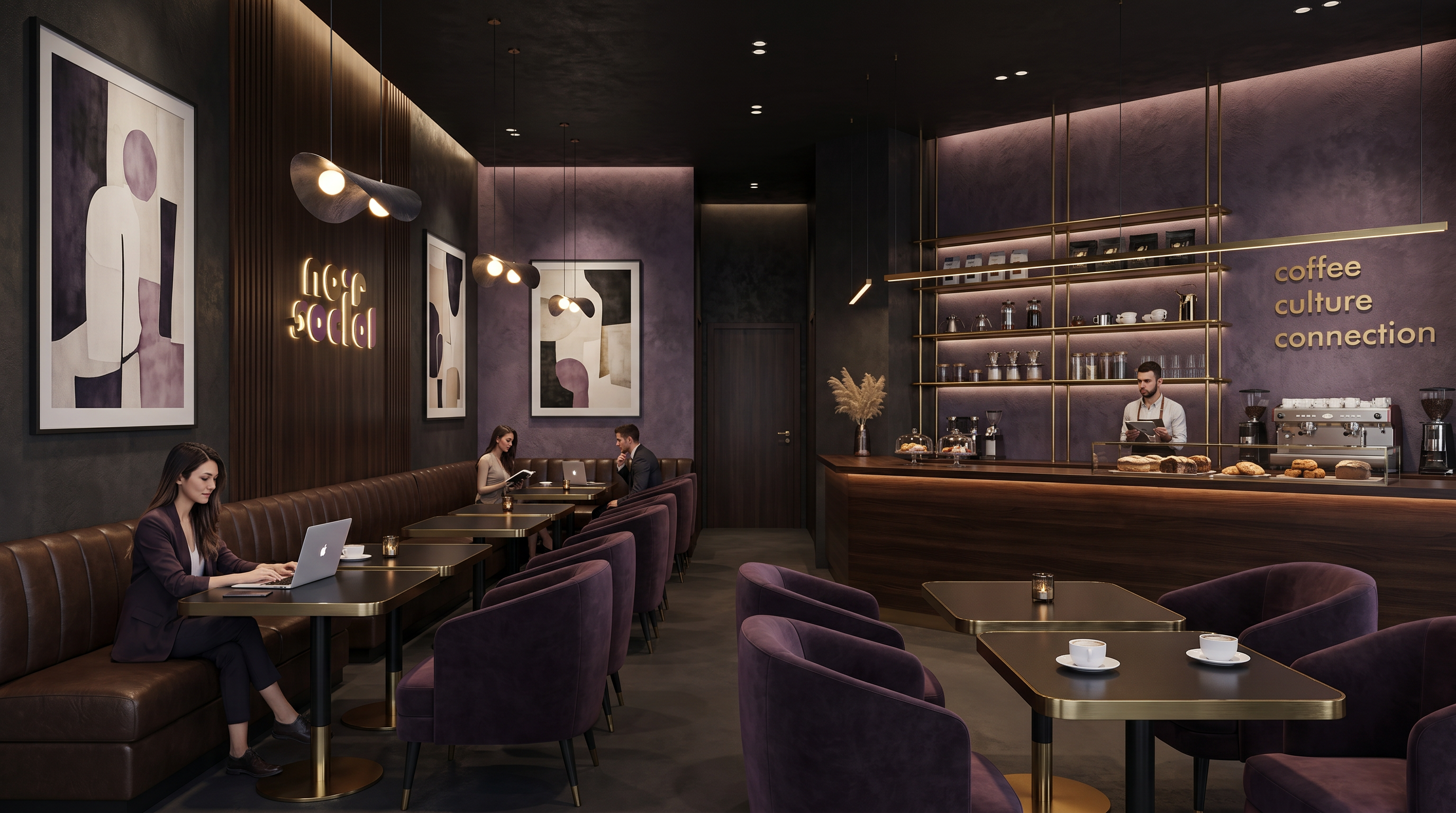
The visual direction combined geometric structure with playful rhythm. This balance helped position the brand as premium but approachable, with enough flexibility to support digital content, interior applications, and product extensions.
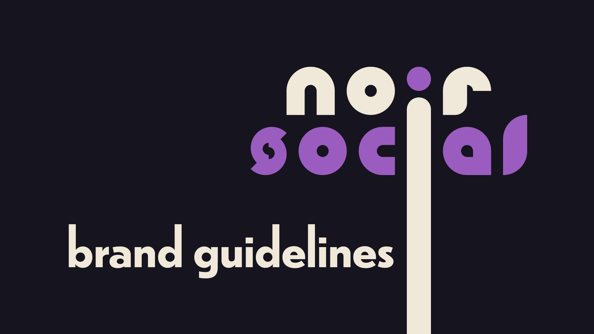
BUILDING THE WORDMARK FROM MODULAR GEOMETRIC FORMS
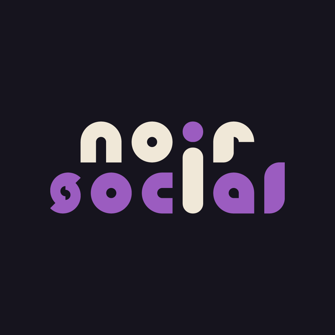
The custom wordmark was developed from repeatable shape logic. Curves and cuts were designed to create a cohesive system where each character has unique personality but still belongs to the same construction family.
BRAND GUIDELINES AND APPLICATIONS
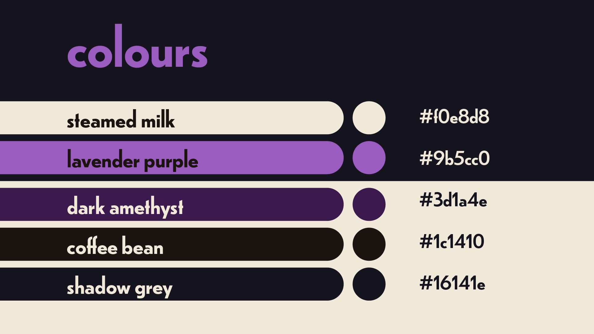
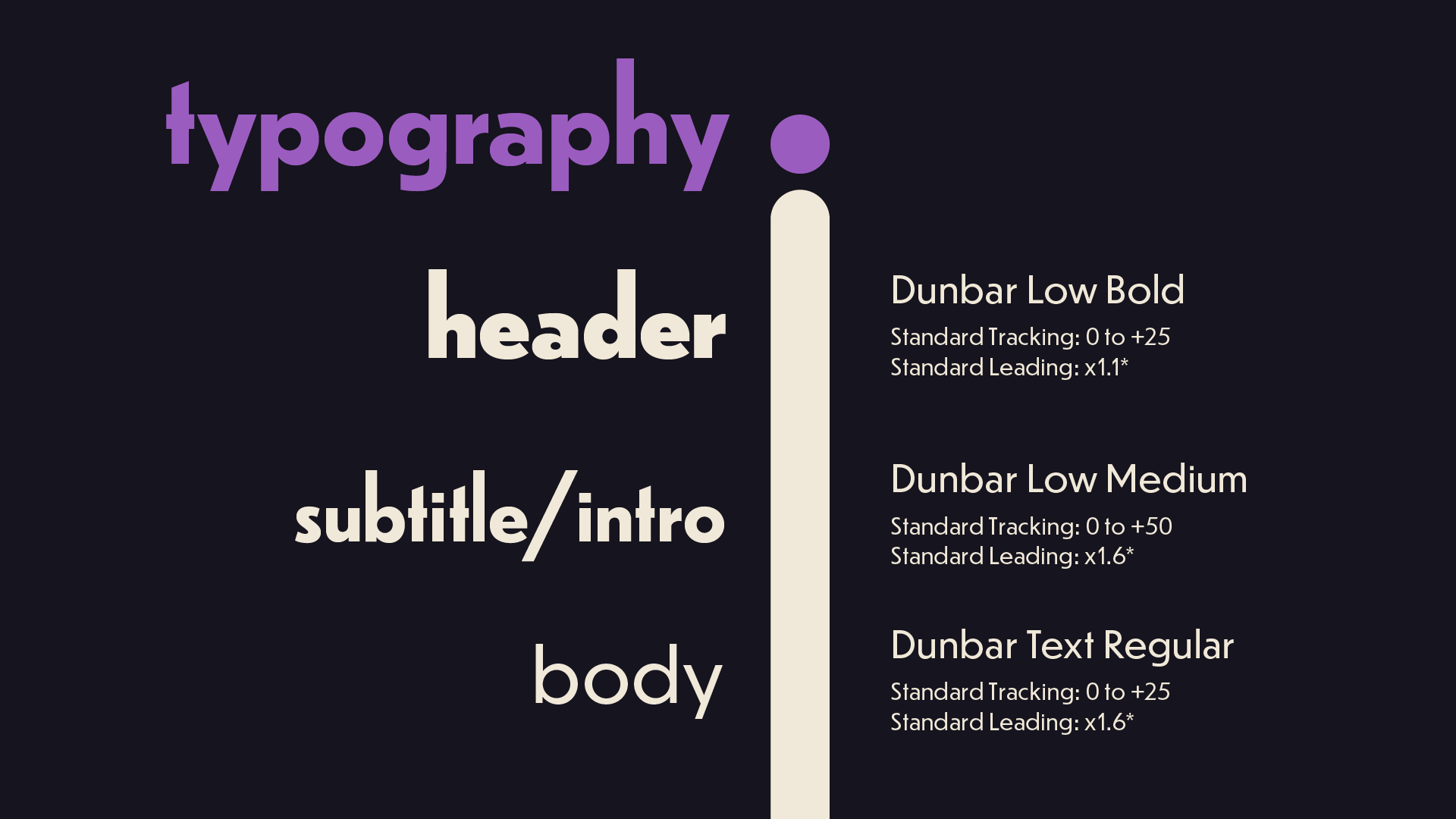
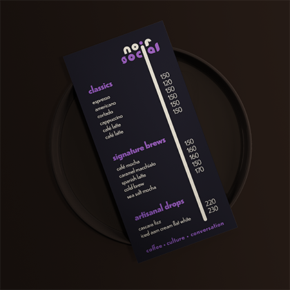
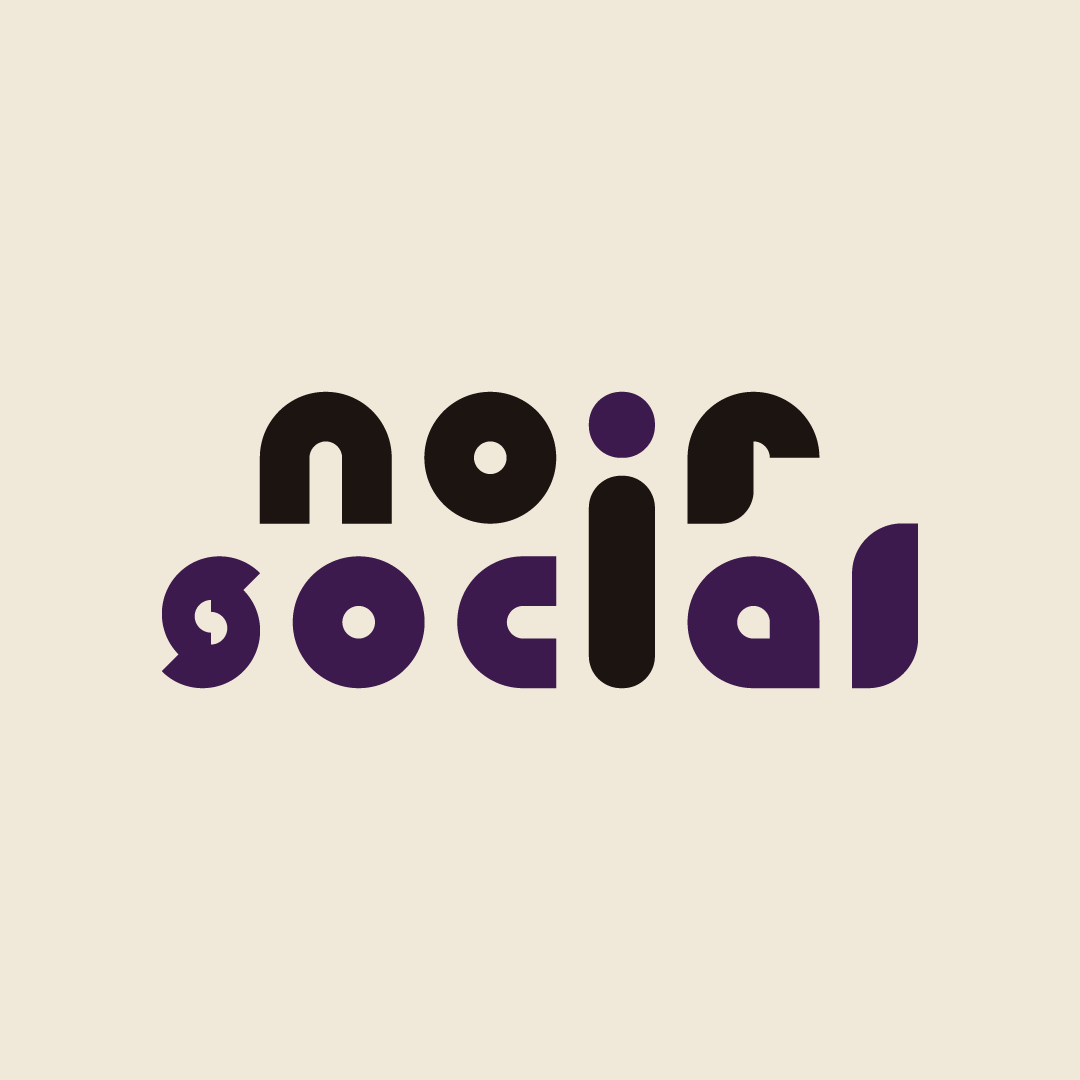
A detailed visual system was documented to maintain consistency across print and digital touchpoints. The framework covered logo use, contrast handling, typography hierarchy, and adaptable layout behavior for campaign materials.