CYCLE SAFARI
A brand identity designed around adventure, community, and immersive outdoor cycling experiences.
DESIGNING THE IDENTITY
FOR CYCLE SAFARI
Cycle Safari is a cycling experience brand centered around guided rides, outdoor discovery, and shared travel experiences. The identity was designed to capture the energy of movement while creating a friendly, adventurous brand presence that could connect with both serious riders and leisure travellers.
The visual direction balances momentum and warmth through a badge-based logo, expressive typography, and a nature-inspired colour palette. Together, these elements create a system that feels active, memorable, and adaptable across both digital and physical brand touchpoints.
THE CHALLENGE
Cycle Safari needed an identity that could feel adventurous without becoming overly extreme, and community-driven without losing its sense of motion and excitement. The challenge was to create a brand that felt equally suited to cycling tours, travel-led storytelling, event promotion, and branded merchandise.
The solution was to build a system around movement, discovery, and togetherness—using a bold circular mark, uplifting colour, and flexible brand applications that could scale across different touchpoints.
A LOGO BUILT AROUND MOVEMENT AND EXPLORATION
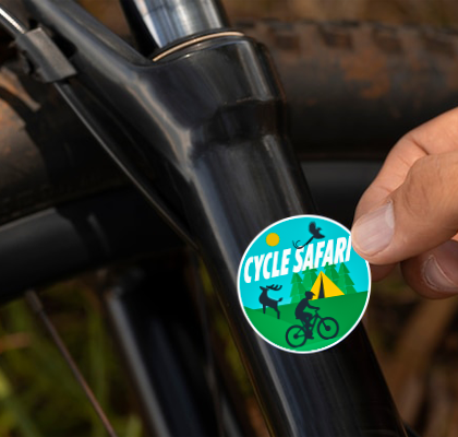
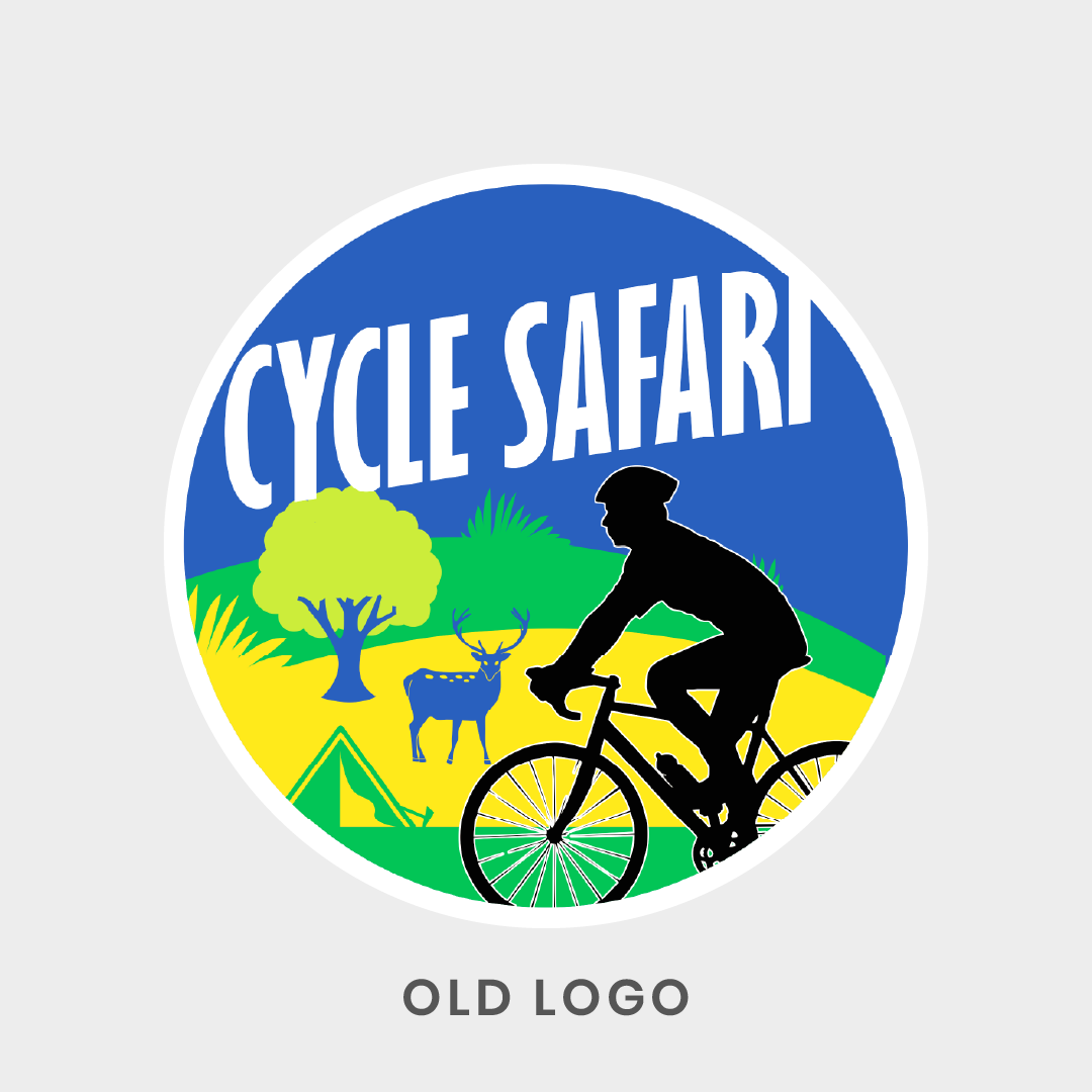
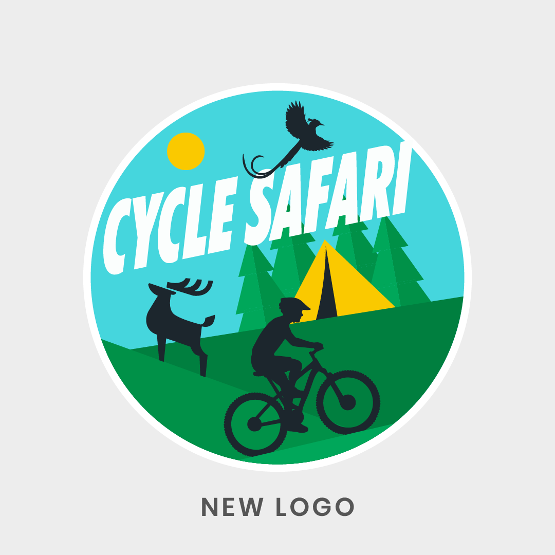
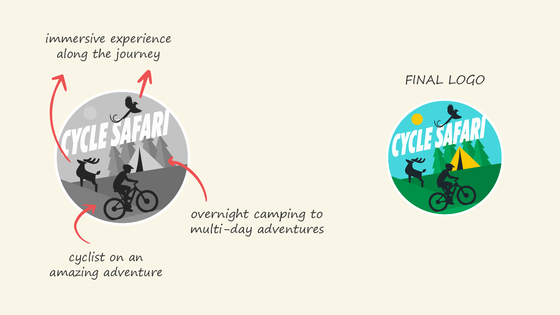
The logo uses a circular badge format to create a strong, compact identity that feels unified and easy to apply across merchandise, apparel, and digital media. The angled typography introduces a sense of forward motion, echoing the momentum of cycling and the upward energy of outdoor travel.
Supporting symbols such as the bird and sun help reinforce the brand’s connection to freedom, open landscapes, and memorable outdoor experiences. The palette of green, blue, and yellow adds freshness and warmth while grounding the identity in nature and adventure.
BUILDING A FLEXIBLE BRAND SYSTEM
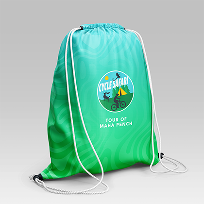
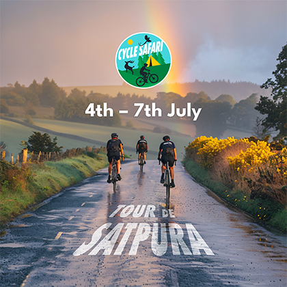
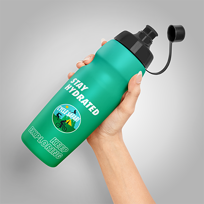
Beyond the core logo, the project included a visual system for applying the identity across campaign materials and brand touchpoints. This included logo variations, colour guidance, typography hierarchy, and layout principles designed to keep the brand consistent across print and digital formats.
The resulting system allows Cycle Safari to show up cohesively across posters, merchandise, social media, event collateral, and other branded assets while preserving the brand’s energetic and outdoors-oriented character.